Wednesday 23 December 2015

Notes on Eisenstein's Methods of Montage - Part Three - The Tonal

Tonal Montage: Transitions are employed to illicit a specific emotional response from the audience.

This is a scene from Damien Chazelle's Whiplash (2014). Ostensibly it's a film about a drummer. By any means it's a film about a drummer. Why would this be a good example of tonal montage?

Whiplash, Damien Chazelle (2014)

Despite the rhythmic theme of the film, you can't carry a feature film narrative on tub thumping alone. For me this scene is more about emotional hits than the complexities of jazz drumming. We witness the nervous father, the talented son and the erstwhile, maligned teacher. It's all about the reactions. That's not to say the sound isn't hugely impressive.

Unsurprisingly, this film took Oscars and BAFTAs for editing and sound amongst others.

One of the few films I've deliberately watched repeatedly and enjoyed every time.

Thursday 10 December 2015

Attributed to Tom Rolf... "I love you"

Tom Rolf, (editor on Taxi Driver (1976), Jacob's Ladder (1990), Heat (1995) and Equilibrium (2002) amongst others) offered this comment. I can't find a definitive source for the quote but it rings true. 
“Is it better to say, ‘I love you,’ bang, then cut to the reaction? Or is it better to say, ‘I love you,’ hang on it for a beat to show the emotion of the person delivering the line, then go for the reaction? 
It’s a matter of choice. 
Either way, there’s a different result for the audience looking at it. 
Are their sympathies with the guy who said the line, or the girl who said the line? Or is the audience saying, ‘Don’t believe him, he’s going to screw you over’… 
If you find the frame to cut on at that right moment, the audience will be totally satisfied.”
Quote attributed to Tom Rolf, Editor

Not a Tom Rolf edited scene. Very much a sequence of action and reaction shots maintaining eye-line and tempo, both rhythmic and tonal. Mick Audsley takes the editing credit on this one.

 High Fidelity,  (2000)

Notes on Eisenstein's Methods of Montage - Part Two - The Rhythmic

Rhythmic Montage: Shot length is dictated by visual elements such as movement and composition.

Taken from the Planet Doc series Land of the Dragons, this series of shots shows us the courting rituals of the Fiddler Crab.

There is a visual continuity throughout the scene. The colours of the crabs and their environment give us a background of browns and yellows with flashes of brilliant red and orange from the male crabs’ claws. Although portrayed with temporal continuity, I suspect that this is actually a montage of many different shots over an extended period of time. As one crab looks very much like another, only the narrator’s contribution and some directorial decisions tie the shots into a story.


The twitching movements of the crabs lends a tempo to the transitions (hard cuts), an example of rhythmic montage. Most shots are not cut on action but in the spaces between. A suitably rhythmic electronic soundtrack is also employed to accentuate this twitching rhythm.


Shot 1
Eye level mid shot.
The female crab quickly feeds herself
Shot 2
High angle, long shot.
Two males have approached and wave their claws for attention. Two waves to the rear, three waves to the fore before the cut to close up.
Shot 3
High angle mid shot.
Starting with a metallic hit on the soundtrack, the shot features the bright orange claw in the centre third. If that weren’t a strong enough image, the orange object in the background also points us down along the claw.
Two waves before the cut to a reverse angle.
Shot 4
Reverse angle eye level mid shot.
Starting with another metallic hit.
A rival appears. Composed in reverse, in opposition. This crab’s claws are on opposite sides though giving a compositional continuity, the bright orange shapes appear consistent.
In this shot though, the claw has moved further up the screen perhaps portraying dominance.
Two waves back before a cut to a high angle long shot.
Shot 5
High angle long shot.
The brightly coloured males leave the shot, one remaining (bottom centre of screen) before moving off screen left.
The soundtrack, an electronic rhythm (high hat?) reflects the skittering movements of the crabs’ legs.
As he is about to leave shot, there is a cut on action
Shot 6
Eye level tracking shot.
The electronic rhythm continues.
The crab remains in motion, moving screen left as the camera tracks. Visual continuity is maintained, the bright orange claw remaining screen left. The crab is now facing away from us however. His claw has swapped sides.
He approaches a female and is spurned.
Cut to extreme close up.
Shot 7
Eye level extreme close up.
The crab’s eyes are in sharp focus, his claw remains at screen left as he looks out for another mate.
Two waves and the sound is cut four beats before the next shot. Our crab is deflated.
Shot 8
Eye level medium close up.
Soundtrack is a higher pitched, cleaner electronic rhythm.
Very similar to shot 1, we see the female alone having escaped our protagonist’s advances.
She moves off screen left followed by another male. Pointedly, this opponent’s claw is presented from the reverse side as he steals the girl.

The Madness of Fibonacci and the Strobe

Just indulge me on this one...

https://youtu.be/nom7NiTLrFg

Persistence of Vision - Brain or Eye?

As I'd casually mentioned "persistence of vision", I thought I'd drop in a note. After all, if it wasn't for this quirk of our eye/brain mechanism, the zoetrope, cartoon or photographic film would never have been invented. If they had, they would have appeared to us as a stream of stills, a passing curiosity in an avant garde art form maybe. 


http://leah-reynolds.com/files/leahreynolds/zoetropes3d_copy.jpg


"The theory of the animated cartoon preceded the invention of the cinema by half a century. Early experimenters, working to create conversation pieces for Victorian parlours or new sensations for the touring magic-lantern shows, which were a popular form of entertainment, discovered the principle of persistence of vision. If drawings of the stages of an action were shown in fast succession, the human eye would perceive them as a continuous movement."
http://www.britannica.com/art/animation#ref715172

https://upload.wikimedia.org/wikipedia/commons/7/7d/Sparkler_Circle.jpg

We've become so accustomed to the illusion of rapidly changing images as a representation of movement that it's easy to forget it entirely. At least as children we could be amazed that we could draw circles in the air with a sparkler.

"Persistence of vision is a commonly-accepted although somewhat controversial theory which states that the human eye always retains images for a fraction of a second (around 0.04 second). This means that everything we see is a subtle blend of what is happening now and what happened a fraction of a second ago. 
In film and video, this phenomena is often claimed to account for our ability to perceive a sequence of frames as a continuous moving picture. However this idea was debunked in 1912 and there is no scientific evidence to suggest that persistence of vision works in this way. Rather, it is thought that the illusion of continuous motion is caused by unrelated phenomena such as beta movement (the brain assuming movement between two static images when shown in quick succession). 
Despite this, persistence of vision continues to be incorrectly taught in schools as the physiological mechanism behind video's illusion of movement."
http://www.mediacollege.com/glossary/p/persistence-of-vision.html
There may be some dispute over the hows and whys of the effect. For a film maker or animator, isn't it enough to know that the audience will accept 24 or 25 pictures per second as natural movement?
For now.


Notes on Eisenstein's Methods of Montage - Part One - The Metric

Metric montage: Shots are of equal length or number of frames

To take essentially organic elements, a performance or a scene and apply this strict method of timing appears the simplest yet least forgiving and most stylised treatment.

In searching for examples, I found it difficult to identify a piece of film that complied with this strict timing method that had not been produced specifically for the purpose of demonstrating it.

This student film is an example of an entire short film adhering strictly to the metric method.


Each shot is shoe-horned into the same number of frames. It doesn’t appear to advance any story nor increase the visual appeal of the piece. It may be that metric montage is not intended to stand in isolation.

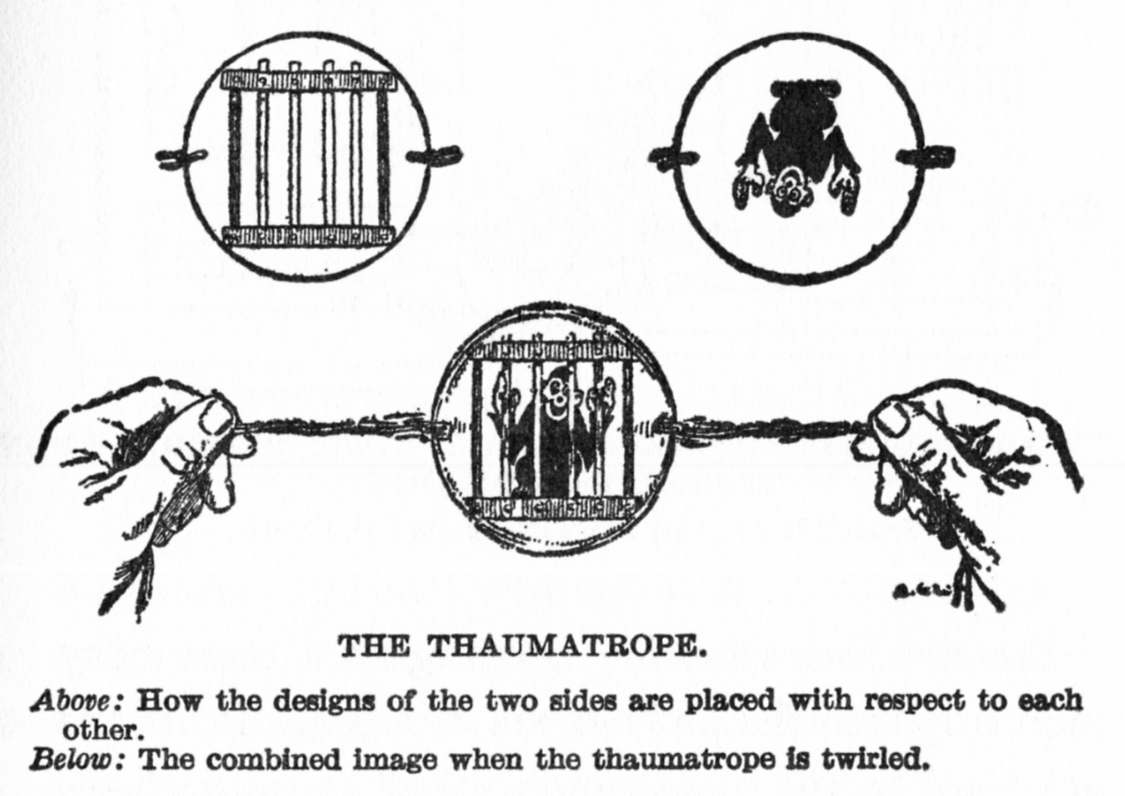
There are brief moments in Eisenstein’s own film October (1927), shots of a machine gunner and his weapon. The shots are rapidly and repeatedly edited to perhaps only a few frames each with a short fade transition. This almost gives us a Thaumatrope-like effect. Our persistence of vision not quite merging the two images.


Even without sound, these short, metric montages do convey the physical violence of the gun shots. The images are hammered at the audience as the gun is fired into the crowds. If the individual shots had been held any longer, the effect would be subdued, less violent. Any quicker and the images could have merged as in the Thaumatrope effect. 

Stills taken from: October, Sergei Eisenstein (1927)


Tuesday 24 November 2015

Continually Confusing - Part Three

Although not the first to employ editing in film, the likes of Sergei Eisenstein and Lev Kuleshov formulated techniques and theories, raising the editing process to an art form.


Eisenstein believed that editing could be used for more than just expounding a scene or moment, through a "linkage" of related images. Eisenstein felt the "collision" of shots could be used to manipulate the emotions of the audience and create film metaphors. He believed that an idea should be derived from the juxtaposition of two independent shots, bringing an element of collage into film. He developed what he called "methods of montage"

https://en.wikipedia.org/wiki/Sergei_Eisenstein#Film_theorist


Eisenstein formulated his Methods of Montage, detailing several principles of film editing.

Sergei Eisenstein – Methods of Montage
Metric
Shots are of equal length (number of frames)
Rhythmic
Shot length is dictated by visual elements such as movement and composition.
Tonal
Transitions are employed to illicit a specific emotional response from the audience.
Overtonal
Overtonal montage may utilise metric, rhythmic and tonal techniques.
Intellectual
Presents and conveys intellectual ideas through juxtaposition, symbolism and metaphor.

Lev Kuleshov famously studied the effects of juxtaposition in film editing.


In the dawn of the 20th century, cinema was a new art form, comprising many techniques that hadn’t been developed. And the ones that had had not been studied to the needed extension. The elements of editing were among them. Filmmakers knew that you could cut and splice the film strip, but they didn’t thoroughly comprehend the purposes of doing so.

Lev Kuleshov, a Soviet filmmaker, was among the first to dissect the effects of juxtaposition. Through his experiments and research, Kuleshov discovered that depending on how shots are assembled the audience will attach a specific meaning or emotion to it.

In his experiment, Kuleshov cut an actor with shots of three different subjects: a hot plate of soup, a girl in a coffin and a pretty woman lying in a couch. The footage of the actor was the same expressionless gaze. Yet the audience raved his performance, saying first he looked hungry, then sad, then lustful.
www.elementsofcinema.com/editing/kuleshov-effect.html


http://haverholm.com/wp-content/uploads/2015/07/Kuleshov.jpg

Film and sound editor Walter Murch discusses the art of film editing in his book, In the Blink of an Eye (Silman-James Press, 1995). The theme of the book lies around the process of editing, why it should work and its acceptance by the viewing audience.

Murch proposes six guiding considerations for editing in film. Although referred to as “the Rule of Six”, they are designed to inform the process rather than be a rigid reference. Correctness and consistency are dependent upon the required effect, the response we wish to elicit from the viewer.

Walter Murch – The Rule of Six
Emotion
Is it true to the emotion that we want to portray, that we want to provoke in the audience? Does it push forward the emotional line?
Story
Does it advance the story? Does it tell the story in way that can be understood by the audience?
Rhythm
Does the cut happen at the “right” point? Does it feel correct and interesting? Does it fit in the overall and established rhythm?
Eye Trace
Where is the audience looking during the shot? Is the eye carried smoothly during the transition?
2D Plane
The representation of the 3D space on a 2D plane (the screen). Questions of “stage line” (the 180 degree rule) and composition
3D Space
The positioning of actors and objects in the 3D space. Are they represented coherently and consistently?

Murch, Walter, In the Blink of an Eye, Silman-James Press, 1995

Where Murch is more firm is in the primacy of each rule over those that follow. While all six conditions may be met in most circumstances, where, perhaps for practical reasons, any must necessarily be excluded, the priority is to maintain emotion over story, story over rhythm and so on.

Continually Confusing - Part Two


“What is drama but life with the dull bits cut out.”

Alfred Hitchcock

Here Hitchcock may have been referring to elliptical editing, the technique of compressing time, skipping the unnecessary (“the dull bits”), while maintaining continuity.


puffin.creighton.edu/fapa/Bruce/0New%20Film%20as%20Art%20webfiles/all%20texts%20and%20articles/editing/editing.htm

These shot setups from his 1960 film, Psycho, seem more representative of temporal or continuity editing but demonstrate some of the same technique.

The scene is presented in “real” time. Where he has allowed the viewer to skip the “dull bits”, he has accomplished it via edits. The camera is not static but cuts to the shots necessary to progress the story, heighten drama and view the players’ actions and reactions.

The diagram below represent the various camera set ups employed in the scene. It’s apparent that this is not a conventional sequence. Hitchcock has not adhered to the 180° rule. From the establishing shot he employs many different angles. Hitchcock though could not be accused of being an unthinking, sloppy film maker.


puffin.creighton.edu/fapa/Bruce/0New%20Film%20as%20Art%20webfiles/all%20texts%20and%20articles/editing/editing.htm

Perhaps most noticeable, most far removed from the established viewing angles are the shots from the driver’s point of view, of the policeman in front of the car (Set Up I). It appears that Hitchcock has used eye line and trace to lead the viewer’s eye.

We can break down the shots in this way:

Set Up H
Low angle mid two shot. We’re under the gaze of the police officer, stuck in the car with Marion.

Her eyes are down as she reluctantly hands over her licence.

Set Up H
The police officer moves away to screen left.

Marion’s eye’s move up to follow him towards the front of the car.


Set Up H
As the police officer exits screen left, Marion stares straight ahead after him.


Set Up H
To accentuate the eye line, Marion’s hand moves to the steering wheel, deliberately pointing the viewer to the front of the car.

This prepares us for the novel camera angle, crossing the 180° line.
Set Up I
Cut to low angle, point of view, mid shot. The officer enters screen right maintaining spatial continuity.

We now know that the police officer is in front of the car and we are looking from Marion’s point of view.
Set Up I
The officer checks Marion’s details and his eyes drop towards the front bumper of the car. His eye line prepares the viewer for the next shot.

Focal point at screen centre.
Set Up J
Cut away to point of view, very close up, high angle shot. Focal point screen centre

The officer’s eye line has led us to his point of view as he checks the license plate.
Set Up K
Eye level, medium close up reaction shot (not from the officer’s point of view). Focal point still at screen centre.

Marion cranes her neck in an effort to see what the officer is doing. She’s looking for a reaction.
Set Up I
Low, reverse angle, mid shot. This is a reaction shot (although there is no reaction). Marion’s obvious concern or curiosity is shared by the viewer.

The officer is standing slightly to screen right in preparation for moving in that direction and leading us back to Set Up H (car interior).


Continually Confusing - Part One

Sources of information on film continuity rarely define the term, moving instead to describe the techniques involved.

Noun: continuity

1.     The unbroken and consistent operation of something over time.

Synonyms: continuousness, uninterruptedness, flow, progression

-       A state of stability and the absence of disruption
-       A connection or line of development with no sharp breaks

Plural noun: continuities

Synonyms: interrelationship, interrelatedness, intertextuality, interconnectedness, connection, linkage, cohesion, coherence

2.     The maintenance of continuous action and self-consistent detail in the various scenes of a film or broadcast.
Definition from www.google.co.uk

Considering Continuity

Why do we need to consider continuity in film making?

If our films were to comprise a single shot from one camera angle, much like a single scene taken from a traditional stage play, continuity would be guaranteed, unavoidable. The audience would experience the entire story from a single, consistent angle with no break in the action. This was the technique used by the earliest film makers believing, as they did, that splicing together different shots would confuse the audience.


switchbackroad.files.wordpress.com/2012/10/heightstour123rnational-tour-company.jpg


It would not take long for the early pioneers to discover that the audience would accept editing and that it could be used to great effect. Shots from differing angles and positions could be juxtaposed to move the story forward while maintaining the attention of the audience. The moments deemed unnecessary to carry a story could even be removed altogether.

Sunday 15 November 2015

How do you make a photo-story? You do it and see how it goes.

Over two weeks and maybe 450 photos, getting sand blasted and hailed on, suffering a nest of ratt-weilers and camera wrangling, I put together a photo-story short.

Fairly early on I decided to produce in black and white. With natural light and a necessarily high ISO value, many of the original photos took on a natural grain that was accentuated in the grey-scale. Adding a high tonal contrast in post-production made for a gritty, moody and almost vintage feel that suited the subject matter and this was carried through to the rest of the footage. I hope this created a consistency throughout the project.

The project is paced slowly, setting the scene, introducing the character and his environment and building the story. Foley sounds have been applied to lead the story and assist in atmosphere.

Many of the transitions are fades (between shots and to black) and these are meant to convey a sense of passing time. Several shots feature subtle zooms to suggest travel, a movement through the scene. Where harder cuts are used, the intention is to provide contrast with the subtly of the general pace of the project.


The scenes are paced to build from a moody, slow beginning towards the finale which is more up-tempo, brighter and, ultimately, to a happy ending.

How do you make a photo-story? Planning before performance

I'm thankful that I can count myself as being a learner in these arts. Being a learner means I can make mistakes like not planning before shooting.

Having said that, I already had a broad idea of my theme and the shots I chose helped me plan...


It was a great help to work through the photos, the ideas, shot by shot and think about the transitions and the sounds I needed to complete the project.

It's not that I stuck to this plan (not completely) but it was a great (re)starting point.

I discovered that I needed more shots (the weather didn't help with this but with perseverence I got some) and which other resources I should be hunting down.


How do you make a photo-story? To begin, you can only try...

Make a photo-story?

How? I don't know how to use a camera. I've a background in art and design, the concepts of composition are familiar (if distant in time) but the technicalities and practicalities of taking actual photographs remain mysterious.

Best way to learn? Borrow a DSLR and a variety of lenses from a good friend and go for it.

This is a selection of shots that went towards the final story.


I set this up as the establishing shot. It's an eye level, long shot of our protagonist's house.


Moving inside we see the dogs. (high angle, long shot). One of them is watching...


...our man playing his guitar (eye level, mid/long shot).


He's finding it difficult (high angle, long shot, wide angle) and...


... he storms out as the dog looks on (eye level, over shoulder, very long shot).


Our protagonist takes a break (new scene, establishing shot, wide angle) before...


... returning to consider his guitar (eye level, suggesting mid shot)...


 ... and getting back to work... (low angle, close up, narrow DoF)


 ... and playing guitar. (Over shoulder, very high angle, narrow DoF)

After abusing the lack of physical film (while embracing the capacity of digital storage) and taking over 300 photographs, I picked my shots. You'll see the results later.


Dealing with the Premiere

I've been enjoying making our photo-story this last couple of weeks. One little problem has been Adobe Premiere's media export. The standard formats produce huge file sizes (even for a two minute film) but other methods appear to mess with the aspect ratio of the media.

Even when the media seems to have been exported successfully, displaying the file other than on PC (e.g. casting to an external display) seems to cause problems.

The Adobe website provides the following tutorial but I'm not sure it solves my problem

Export a sequence clip in Premiere

In any case, I gave birth to a photo-story by fair means or foul.

Tuesday 3 November 2015

An Attempt at Area Lights

 Leaving behind any idea of colour theory, I just have some time for a look at the different types of lighting available in Maya.


This first example uses one spot key light and a soft area light as a fill. The geometry is very basic and there is no bump mapping in the material. We can see the hard shadows cast by the key light (spot with wide penumbra) and the slightly more sympathetic shadows from the area light.


This second image was created with two area lights. A bump map has been added, the key and fill lights have been coloured to accentuate a contrast in hue and tone. The geometry of each block is exactly the same.

Besides the simple effect of a reflective floor, I've raised the blocks slightly to allow for a "natural" shadow beneath each.

The entire composition also feels more comfortable.

Is it more important though, that the area lights seem to add a touch of realism (at least beyond the last render) to the image?

Having said that, I noticed that I had no definition between the layers of blocks. I bumped them up a bit to cure that...


A round of colour correction adds some drama...


Thursday 29 October 2015

An Experiment in Virtual Lighting #4

For this experiment, I've retired our Mudbox mannequin in favour of a more detailed model. Henry simply didn't have the detail nor the shiny eyes for this experiment.

I've also ditched the mathematical approach while trying to remember the lessons learnt.

We'll call our new model Bernie.

Bernie's a happy chap. He's an old model of mine. I've had to render him in Blender because Maya wouldn't play ball with his textures. The lighting settings are similar to Henry's last set up but we've moved away from the symmetrical composition and lighting that Henry was subject to.


Here's Bernie with a slightly yellow key light supported by a blue fill light (at one third intensity) and a barely noticeable back light. Arranging and capturing a catch light proved quite difficult as Bernie wears glasses. This is a broad light shot illuminating the side of the model facing the camera.


Tracking around Bernie and swapping the key and fill lights on the horizontal, Bernie is rendered in a far more dramatic fashion. The back light also comes into play defining his hat, neck, jaw and shoulder. Bernie's features are accentuated with a greater tonal contrast. His glasses reflect some catch light and there is also a suggestion in his left eye.


Exactly the same shot as above but with the lights rotated around Bernie (on the -ve Y axis in Maya terms). This demonstrates an extreme short light. The portion of the model that is most brightly lit is facing away from the camera.


As a demonstration of the dramatic possibilities of lighting, here Bernie is subjected to a low angle key light and a high angle back light which defines his hat and shoulders. This once friendly character takes on the persona of an interrogator, a stalker or... what else?

This was an easier angle for the catch light to take effect. Unfortunately Bernie only comes alive when he's in serial killer mode.


Sorry Bernie, under this lighting the grin only makes it worse...